8 min read
IGS ENergy
Redefining filters and presets in IMA 360 to improve sales efficiency and management.
Role:
Product Design Intern
Duration:
May 2024 - August 2024
Tools:
Figma, UserTesting
Skills:
User Research, User Flows, Interaction Design, Design Systems, and Prototypes

IMA 360 is a management tool that helps sales representatives keep track of potential companies and sales opportunities.
Sales representatives can sort through thousands of company opportunities within the app. Each opportunity includes key attributes, such as utility provider, contract expiration, and status, which can be filtered so sales representatives can quickly narrow results into a more actionable list of leads.

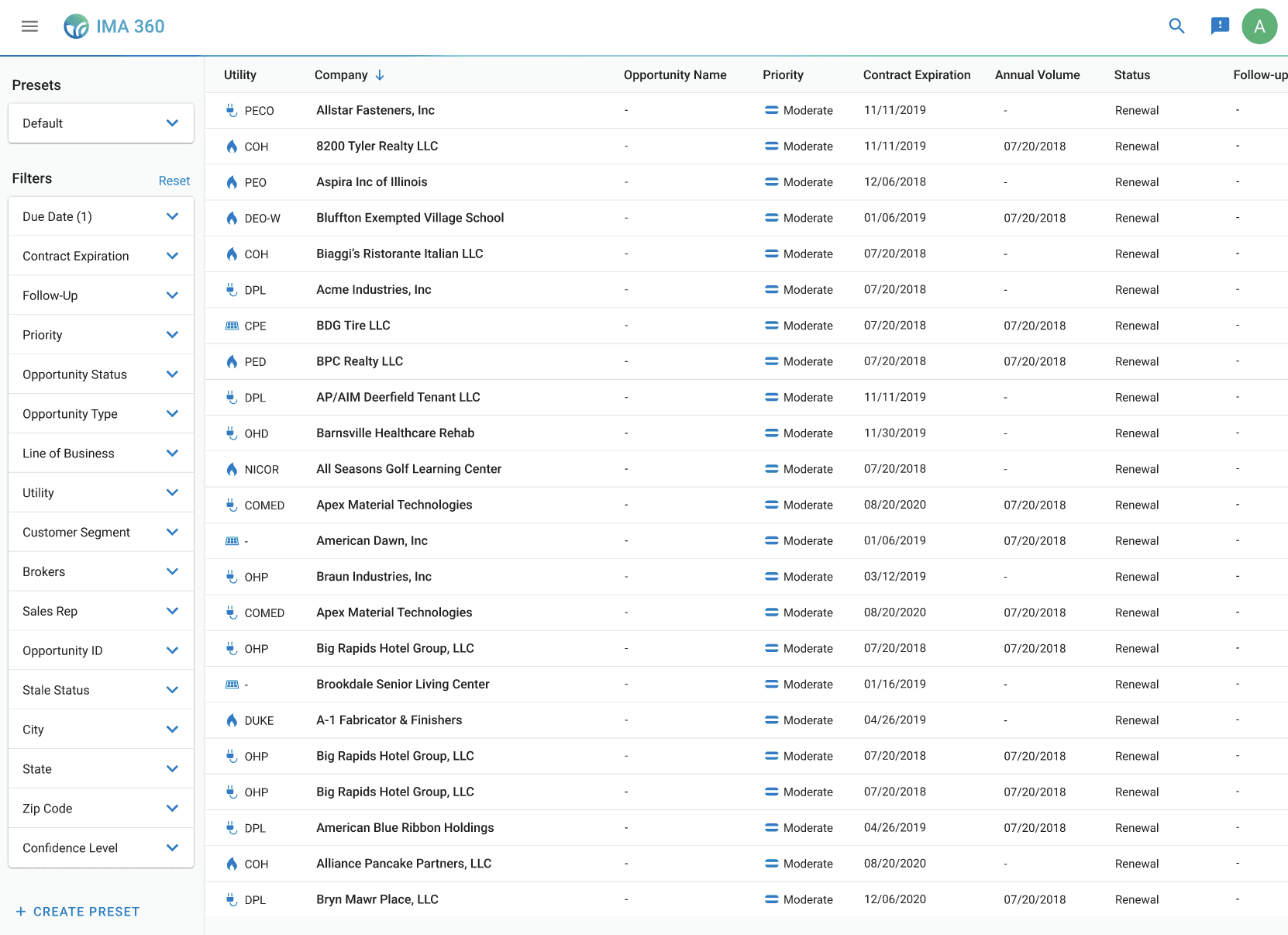
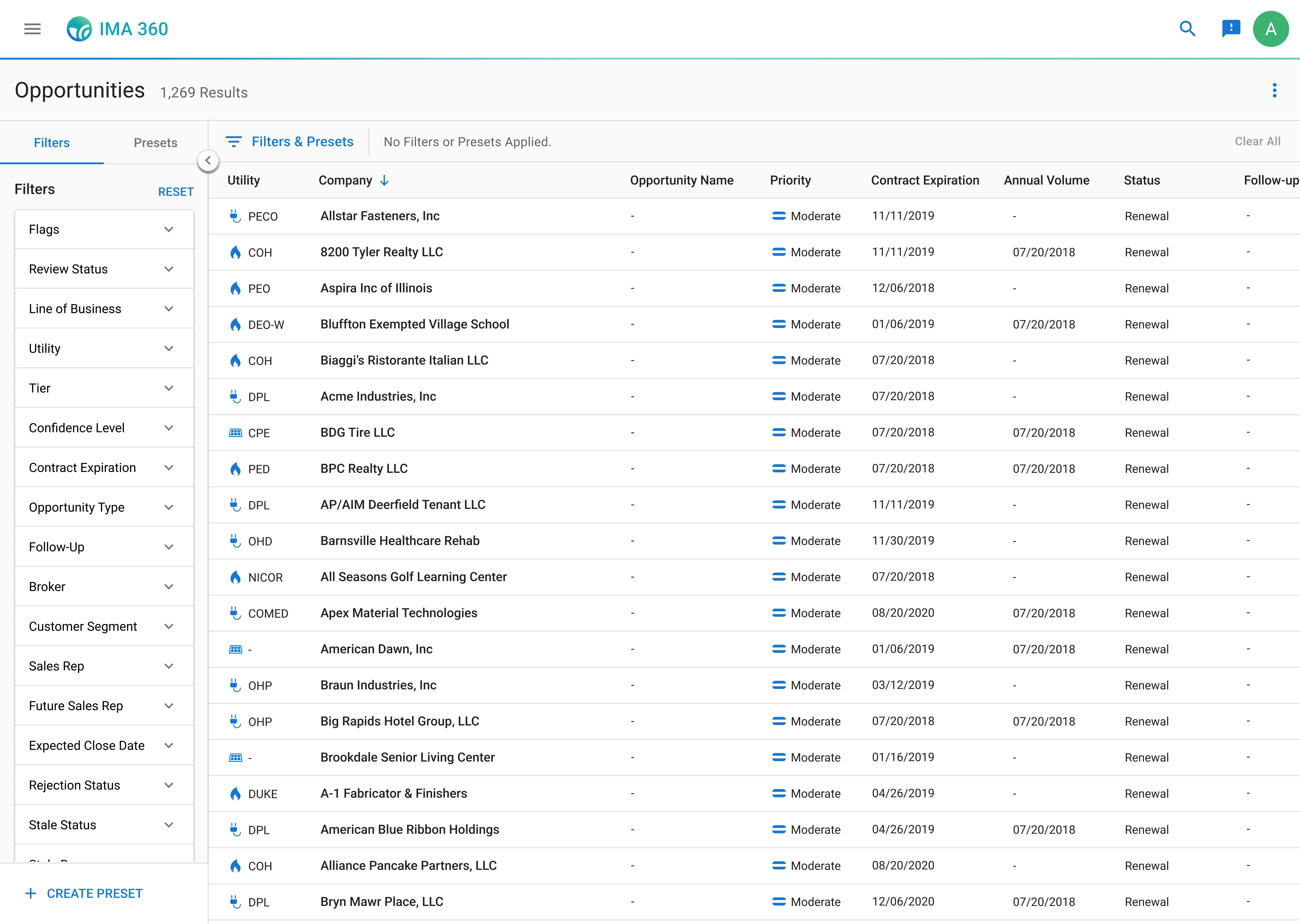
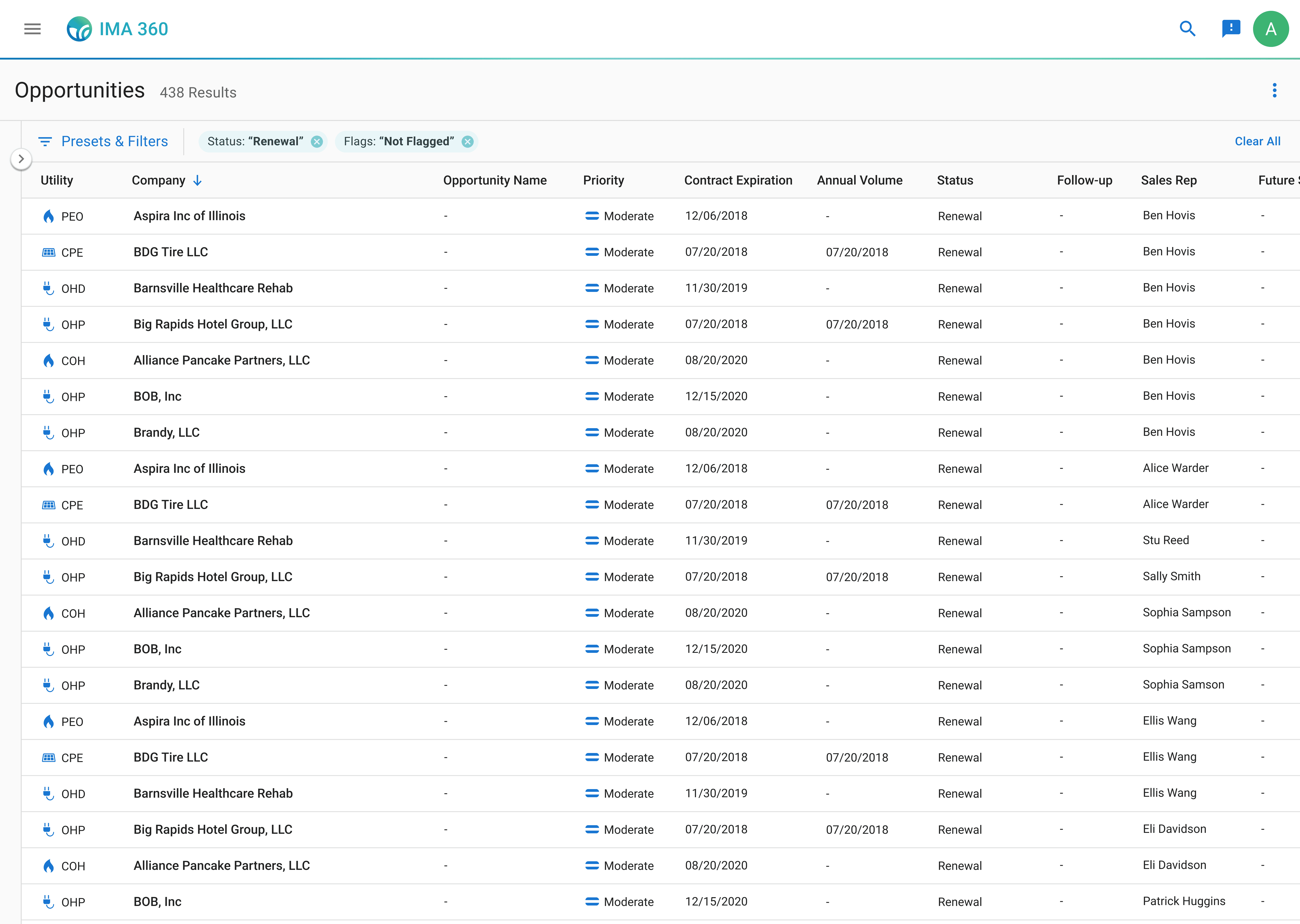
Current IMA 360 experience for sales representatives
Filters and presets are located in a fixed sidebar on the left side of IMA 360. The sidebar displays 26 available filters, each presented as an expandable section. Presets are accessible in the same sidebar above the filter list, with options to create or upload presets with already applied filters to sort through company opportunities.
The Challenge
I was asked to redesign the presets feature because sales representatives weren't using it.
My product manager explained that only a few sales representatives were using the presets feature on the app, and stakeholders wanted them fixed.
What are presets?
Presets are saved filter combinations that allow sales representatives to quickly apply their most-used filters without manually selecting them each time. When sales representatives are not using presets, they are wasting time sorting through potential sales instead of closing deals.
Sales representatives were frustrated, and the business was losing potential sales opportunities.
Digging Deeper
So, why aren't they using presets?
Before I even tried to redesign the presets feature, I needed to understand what was actually happening. So, I conducted user interviews with eight sales representatives, watching their workflow within the app and asking them to talk through their thought process as they worked.
It quickly became clear that filters were the source of frustration.
When talking with sales representatives, a common pattern of concern was that the sidebar containing both filters and presets was simply too much information to process.
"I see all these filter options and just... freeze. I don't know where to start."
"I see all these filter options and just... freeze. I don't know where to start."
"I see all these filter options and just... freeze. I don't know where to start."
I organized these frustrations into 3 clear pain points — and they all revolved around filters.
Sales representatives feel overwhelmed by too many options at once.
The fixed sidebar displays all 26 filters simultaneously, leading to so much information on one page that the sales representatives told me it was more preferable to just block out filters and presets from their flow entirely.
Some of them even found it faster to copy-and-paste the companies into Excel and filter by their own preferred methods, instead of staying within IMA 360.
And for the sales representatives that did acknowledge the sidebar, all of them ignored the presets feature. They focused on the filters, but even then, they struggled to identify which filters were relevant to their current workflow.

Presets were hard to discover and disconnected from filters.
None of the sales representatives I interviewed used presets, so I asked them why. I found out that since the button to create presets was buried at the bottom of the sidebar, beneath all 26 filter options, most sales representatives never scrolled down far enough to even see them.
After sharing the presets feature with them, sales representatives also mentioned that before I showed them how they worked, they did not understand how to use presets in relation to filters. There was no clear connection between applying filters and creating a preset, so sales representatives had no mental model for how or why presets could help their workflow.
Filters were taking too much time.
For the sales representatives that used the filters in their workflows, I also noticed a frustrating experience. Sales representatives would spend time scrolling through the filters, finally end up choosing one, and then look through the company results. But then they would realize that filter wasn't what they needed and would go back to the sidebar to to look for another option to apply.
This constant back-and-forth was eating up time. Instead of using filters to speed up their workflow, sales representatives were almost doubling their time looking through companies.
I also found that 70% of the available filters are never even used.
After learning about how filters were being applied in the interviews, I wanted to understand which filters actually mattered to sales representatives. I conducted card sorting exercises and asked them to choose and group filters by their importance and usage.
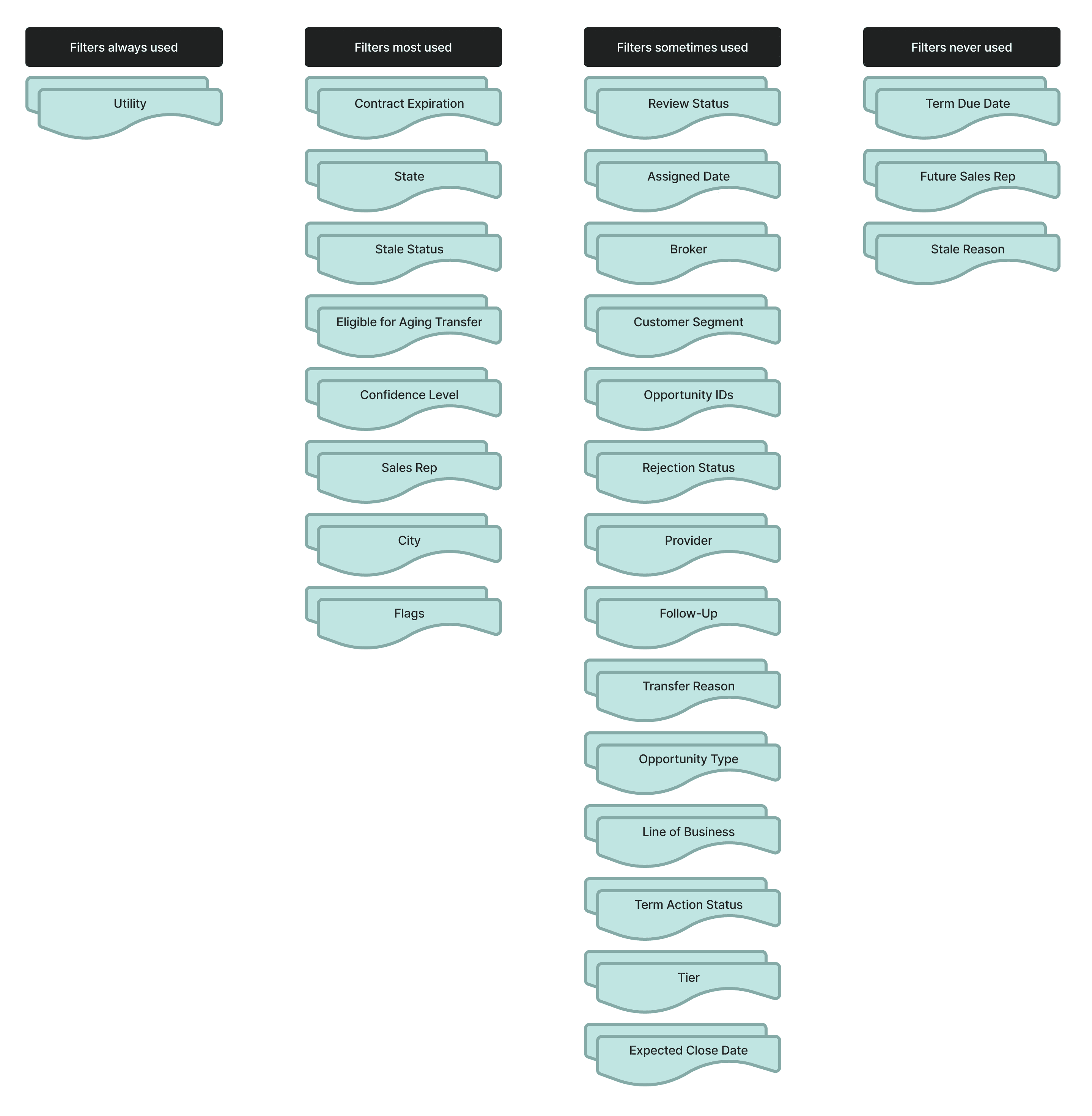
Most sales representatives actively used fewer than five filters in their workflow, which was surprising considering the 26 provided to them. When I asked why they didn't apply more filters to narrow their results further, the answer was consistent: applying additional filters took time and slowed them down.
"I would use more filters, but these four are the quickest to apply, so I use them the most."
"I would use more filters, but these four are the quickest to apply, so I use them the most."
"I would use more filters, but these four are the quickest to apply, so I use them the most."
Sales representatives wanted to use more filters, but doing so would take more time.
The Root problem
All of this research pointed to one clear conclusion: Filters were the problem.
Presets failed because the entire filtering experience was broken. Sales representatives could barely use filters in the first place.
So, I made a choice to pivot the product direction to focus on filters. Instead of redesigning a more distinct preset feature, which was what stakeholders expected, I wanted to deliver something that would solve the actual problem sales representatives were facing. However, this meant challenging the initial problem and expanding the project scope.
I met with my product manager multiple times to walk through my findings with sales representatives in the user interviews and card sorting analysis. In these discussions, I prioritized direct research findings, advocating for the sales representatives, and balancing this redirection with the project timeline for delivery.
Together, we aligned on both business and user needs, expanding the project scope to redesign the filtering experience, with presets integrated as a connected component.
DESIGN ITERATION
With a clear problem definition supported by stakeholders, I began designing solutions to test with sales representatives.
Step 1: Moving filters and presets into a collapsible drawer.
First, I focused on addressing the overwhelming visual clutter of the presets and filters sidebar that sales representatives consistently mentioned in the user interviews.
I introduced a collapsible drawer for filters and presets, which gives control to users and allows them to choose not to see the filters when they aren't actively being used. This ensures that the filters are accessible when needed but can also be easily hidden to maximize screen space for opportunities.
After testing this initial design with sales representatives, filter usage increased from three out of eight sales representatives to all 8 of them using the filters.

Step 2: Making filters and presets more discoverable.
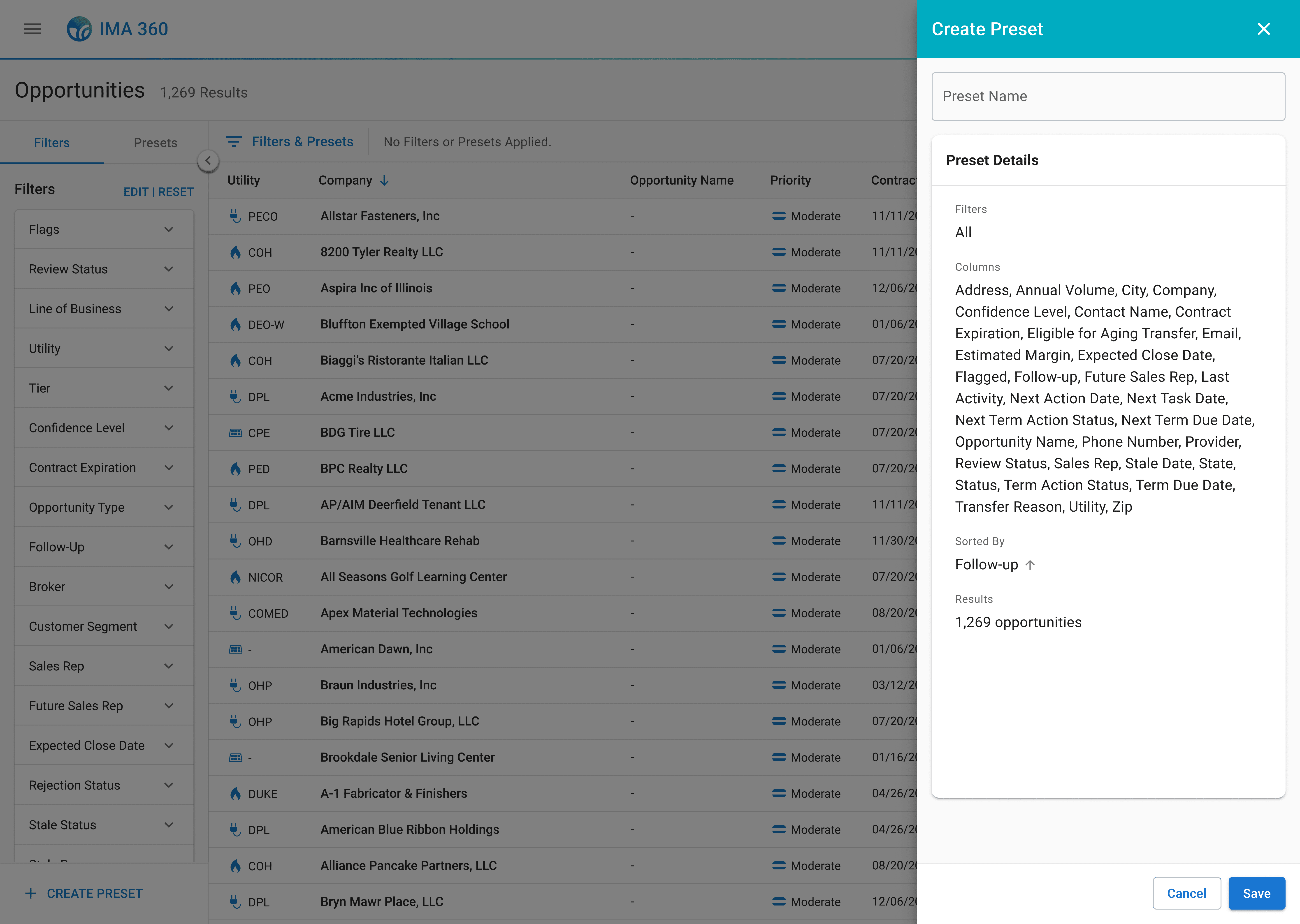
Next, I addressed the confusion between filters and presets. These were two different concepts that needed clear visual hierarchy and distinction. I created separate tabs within the drawer, one for "Filters" and one for "Presets", so users would immediately identify both options.
But, after testing this design, sales representatives were still finding it difficult to connect filters with presets. I needed to show how they worked together. So, I modified the create preset button to be globally visible on the filters tab after applying a filter. This created a clear mental model for sales representatives to apply filters → save them as a preset → view that preset in the presets tab.

User testing also revealed new problem I hadn't anticipated. While sales representatives really liked being able to collapse the drawer to focus on opportunities when they weren't applying filters, closing the drawer made it more difficult for them to (1) remember which filters were still applied and (2) quickly remove and apply a different filter.
"Hold on, did I already filter by this? I can't remember."
"Hold on, did I already filter by this? I can't remember."
"Hold on, did I already filter by this? I can't remember."
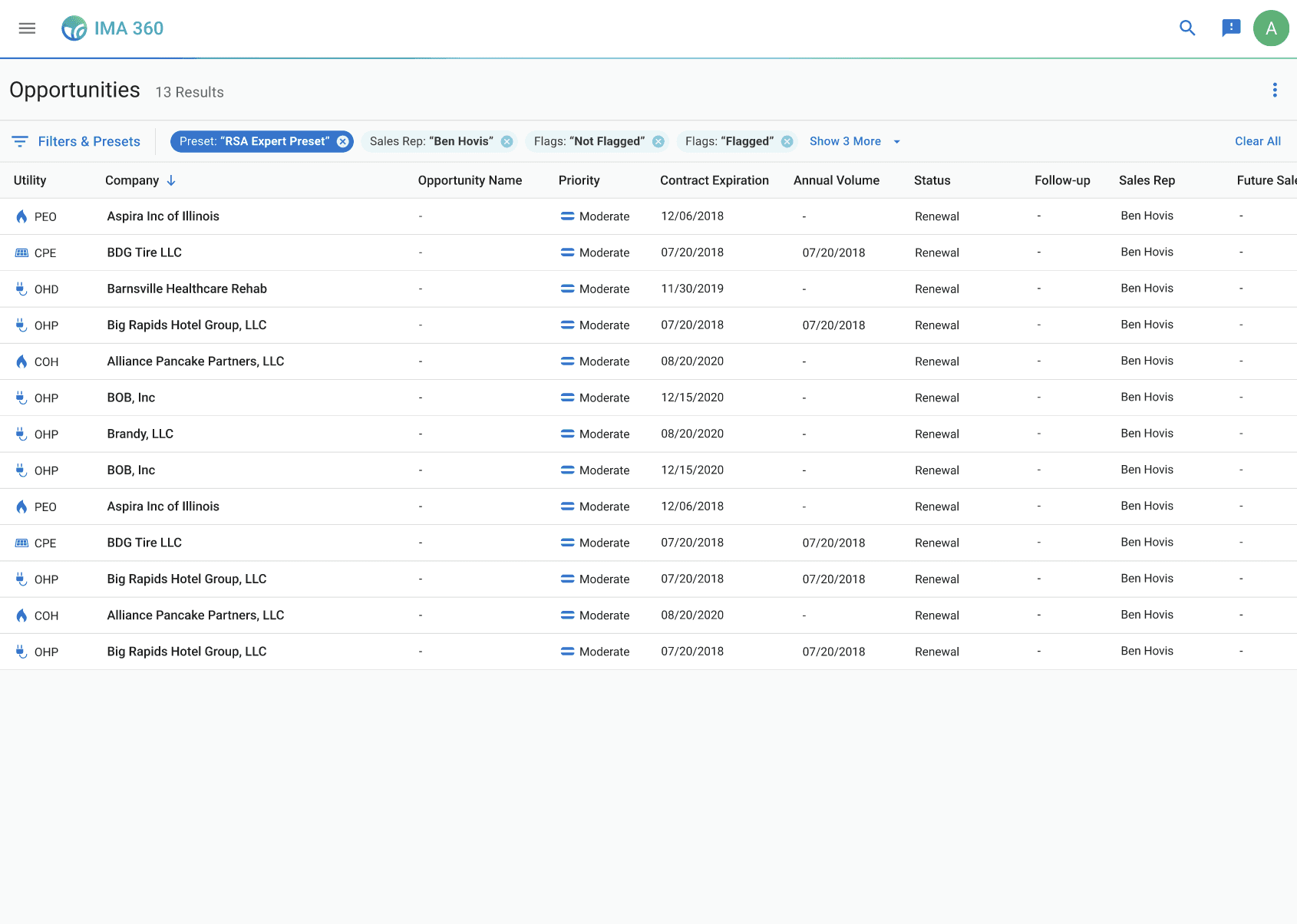
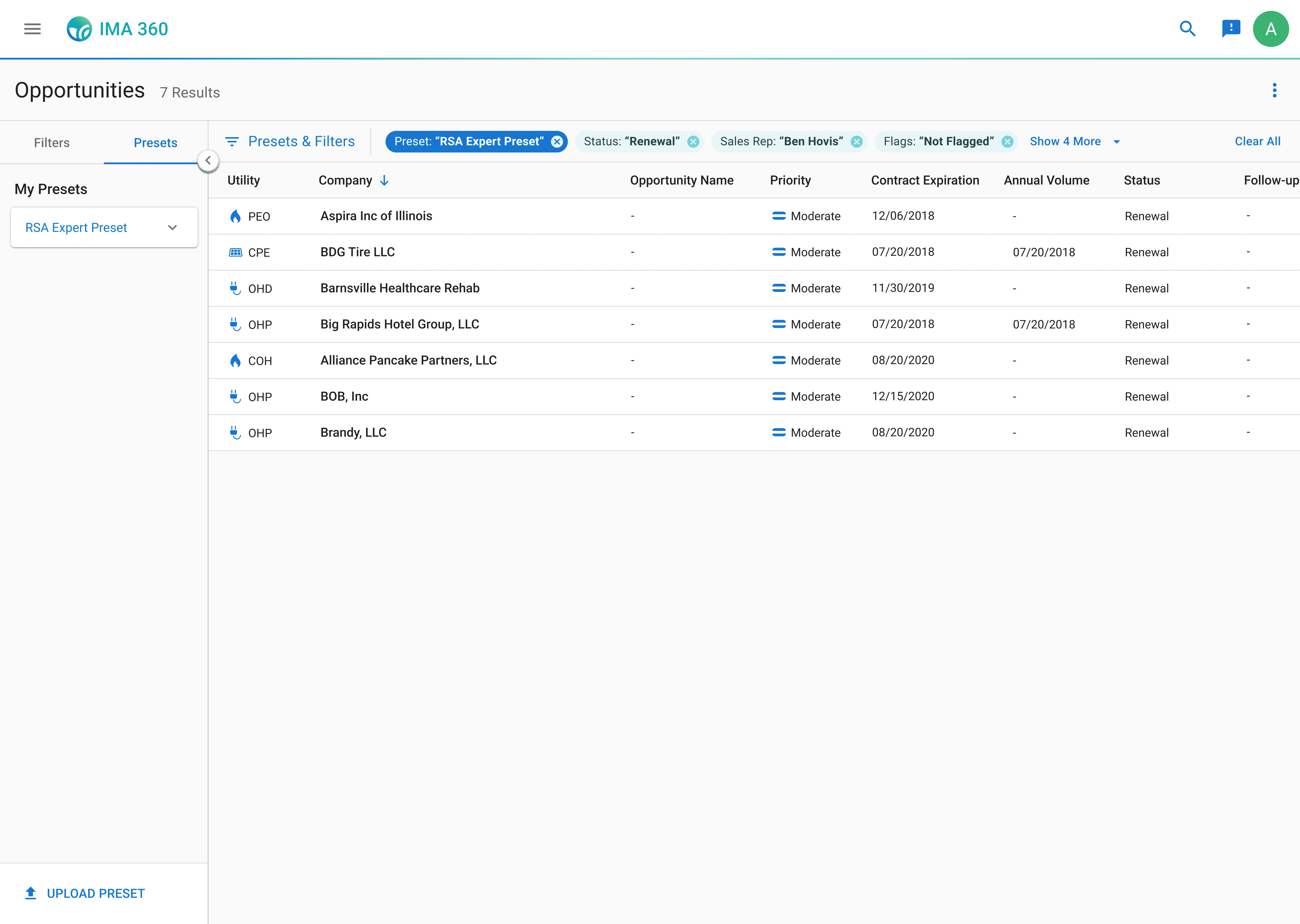
I also had found in my previous research that the back-and-forth of applying filters was slowing sales representatives down, so to address both of these problems, I designed an applied filters bar placed above the opportunities table. This bar showed all active filters and presets even when the drawer was closed. Sales representatives could now always view their applied filtering options, and they could also click directly on any filter chip to remove it without reopening the drawer.
Feedback after another round of user testing was overwhelmingly positive. In completing prototyping tasks before and after, these changes significantly sped up the sales representatives' workflows from 42 seconds to 27 seconds on average to find the opportunities they were looking for.
Step 3: Exploring additional customizations to make filtering faster.
My final iterations focused on giving sales representatives more control. Since many sales representatives expressed interest during the interviews in using additional filters if the process was easier, I wanted to allow them to customize the experience to fit their own needs.
Additionally, each sales representative's process is different. In my interviews, I talked to representatives that worked regionally and others that worked nationally. All of their experience levels varied. Yet everyone was forced to always see the same 26 filters regardless of whether those filters were relevant to their actual workflow.
So, I added an edit feature within the drawer, which allows sales representatives to customize which filters they want to be visible and reorder them according to their needs. This prevents representatives from being overwhelmed with filter options and lets them focus on the key filters they use most to more quickly target opportunities.
Sales representatives also reacted positively to this integration. They reported feeling significantly less overwhelmed with less filters in the sidebar and only keeping the ones that they are familiar with.
"This speeds up my workflow a lot. Now I don't have to see these filters I never use... this is great!"
"This speeds up my workflow a lot. Now I don't have to see these filters I never use... this is great!"
"This speeds up my workflow a lot. Now I don't have to see these filters I never use... this is great!"

Development Hiccup
But engineers said no.
With my designs verified by research, interviews, and direct reactions from sales representatives during testing, I was confident in handing off my final design specs to engineering. But when I presented my designs to the development team, they raised concerns about the customization features. The functionality required significant database restructuring to store individual user filter configurations as well as new front-end components, which couldn't be completed within our 2-week development timeline without delaying the entire product delivery.
My initial reaction was frustration.
The research I gathered validated these features, and they directly addressed user pain points. But from a business perspective, the product needed to be developed within a shorter time frame than my designs allowed.
But then I came back to the north star: making the filtering experience more efficient so sales representatives could find opportunities and close deals faster. I thought, would they rather have better filters in two weeks, or perfect filters in five months?
I needed to compromise between user and business value.
Sales representatives were struggling right now. The key pain point I needed to address was improving their experience as effectively as possible now, which would also deliver business value by shipping the product on time.
Reframing my Designs
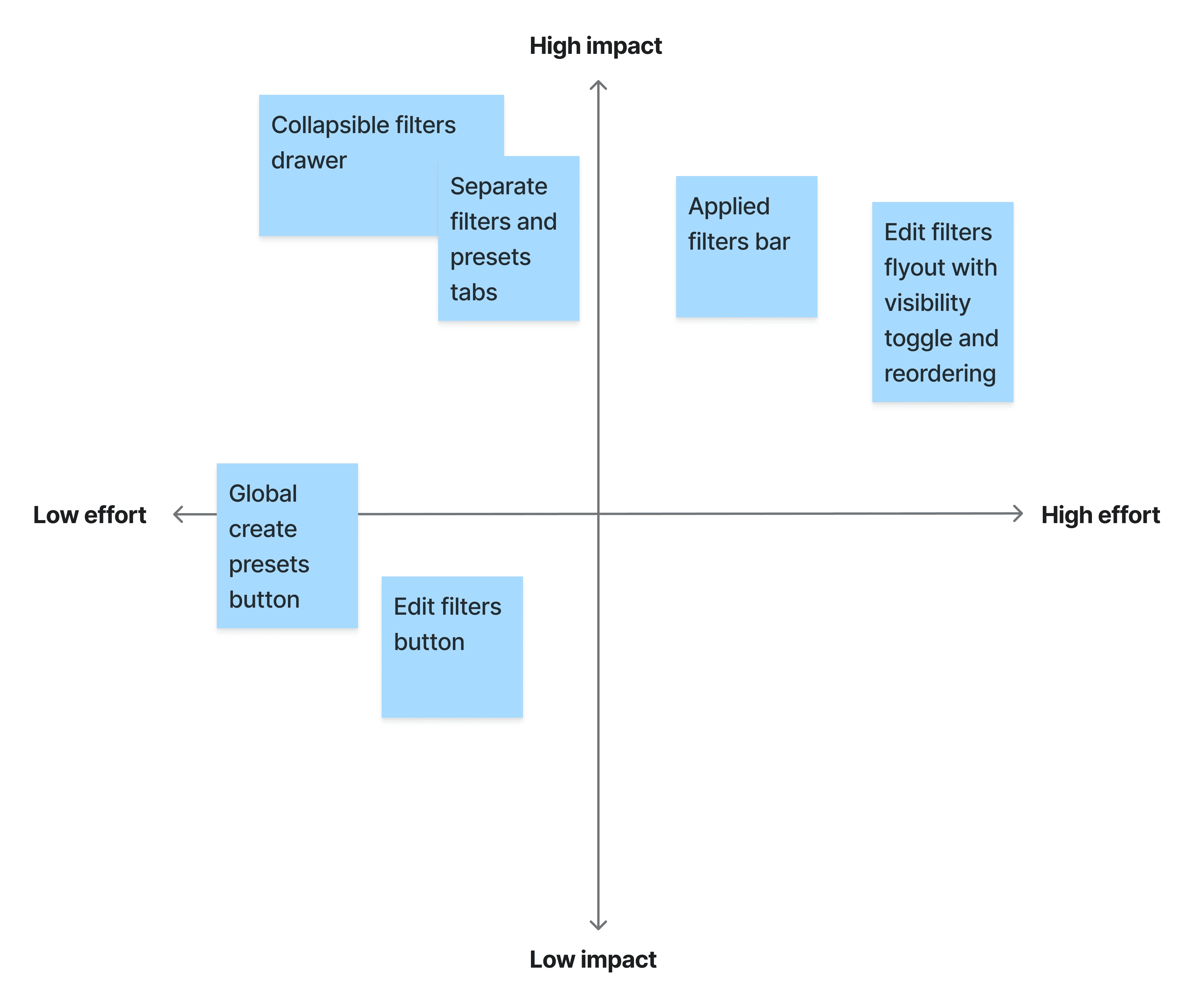
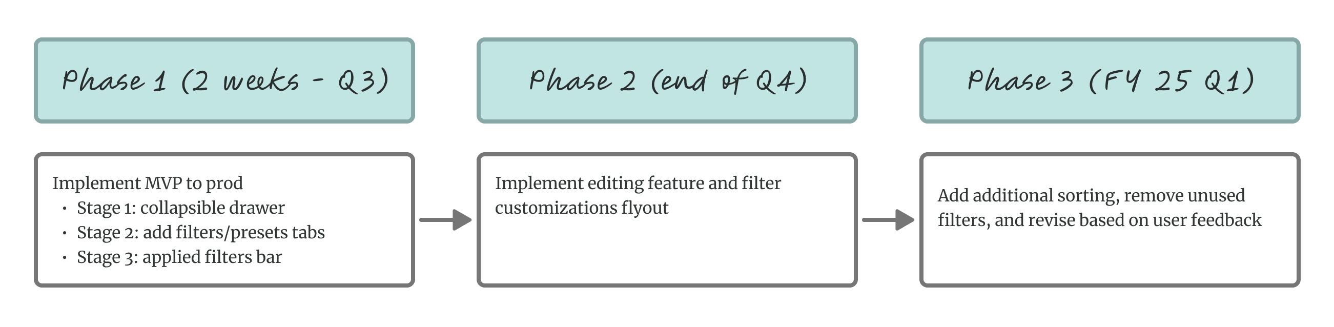
So, I reconsidered my design direction by focusing on an MVP approach, prioritizing high-impact improvements sales representatives could benefit from immediately with minimal development effort and moving lower-value and higher effort designs into a future scope.
I frequently collaborated with the engineering team to map out what designs were achievable within the product timeline. Through multiple conversations, we aligned our scope:
MVP solution: collapsible drawer with separate tabs, global presets button, and applied filters bar
Future scope additions: editing and customization features
I updated the designs to reflect this MVP direction and also spoke with my product manager to create a roadmap outlining the remaining customization features for the upcoming quarters.
I successfully integrated technical constraints and advocated for designs that met user needs.
FINAL DESIGNS
Within the MVP approach, the collapsible drawer gives sales representatives a clean workflow with filters accessible when needed, reducing the cognitive overload they'd described. The separated tabs for filters and presets create a clear hierarchy but also connect their interactions together. The applied filters bar let users maintain context when the drawer is closed and make quick edits without interrupting their workflow.
And the future scope design, to be developed in a later stage of the product roadmap, integrates filter customizations.
Welcome to easier filtering for more opportunities.
The redesigned filtering feature within IMA 360 streamlines how sales representatives filter, organize, and prioritize leads. With a collapsible filter and presets drawer, an applied filters bar, and customizable filter options, sales representatives can now quickly identify high-value opportunities without getting confused or overwhelmed. They can tailor the filters to meet their own workflow needs, creating more efficient work and driving sales.
Impact
Lead generation increased by 60% for 100+ sales representatives within a month of implementation.
The improved filtering system of the MVP design made it faster and easier for sales reps to find relevant companies to target, so they could identify even more more opportunities in less time than before. This meant sales representatives had more hours each week to focus on actual sales work. As a result, IGS Energy was able to bring in more sales.
Some other metrics:
Filter usage increased from 30% to 78% of sales representatives
Filter usage increased from 30% to 78% of sales representatives
Filter usage increased from 30% to 78% of sales representatives
Time spent checking or updating filters reduced by over 20%
Time spent checking or updating filters reduced by over 20%
Time spent checking or updating filters reduced by over 20%
Presets usage increased from 12% to 45% of sales representatives
Presets usage increased from 12% to 45% of sales representatives
Presets usage increased from 12% to 45% of sales representatives
Sales representatives were more consistently performing their workflow within IMA 360 instead of outsourcing to Excel. Filtering and using presets led to a more positive experience with higher satisfaction and usage ratings.
Reflection
Building designs with user value in mind is essential.
This internship really showed me how important it is to design with real people in mind. Conversing and listening to real sales representatives through interviews helped me define the actual problems users were dealing with, not just the business goals on paper. I realized that without talking to users, I wouldn’t have gotten to the root of the problem. Their input was what pushed me to make impactful design solutions that significantly improved their workflows.
Impact comes from balancing user needs with business goals.
I also had to learn how to balance those user needs with the bigger business picture. Working with a PM for the first time gave me a look into how much strategy and organizational goals shape design decisions. It was a challenge—having only three months to understand the company and the stakeholders, the app, and the long-term vision of my product to create something that made a real impact—but that’s where I learned the most. Figuring out how to weigh what users wanted with what the business needed within the timeline constraints pushed me to think into the future, and it made the final design even more impactful for both users and the business.
Work closely with cross-functional teams from the beginning to the end.
In this project, I learned that having conversations with engineering and QA early, even during the research phase, makes a big difference. Although I only met with engineers after realizing I needed to reframe my design scope to address technical limitations, they had a huge impact on making sure I delivered feasible and meaningful value to sales representatives in my designs. Primarily, they showed me how to prioritize MVP designs and break future changes into incremental stages that fit the product roadmap and allowed me to see the tangible impact of my work. Working closely with QA testers also helped me catch potential issues and edge cases to refine flows. For my future projects, I see how important it is to collaborate with engineers and other stakeholders from the start, ask them questions about feasibility early, and verify my ideas are going in the right direction to meet both user and business needs.
8 min read
IGS ENergy
Redefining filters and presets in IMA 360 to improve sales efficiency and management.
Role:
Product Design Intern
Duration:
May 2024 - August 2024
Tools:
Figma, UserTesting
Skills:
User Research, User Flows, Interaction Design, Design Systems, and Prototypes
IMA 360 is a management tool that helps sales representatives keep track of potential companies and sales opportunities.
Sales representatives can sort through thousands of company opportunities within the app. Each opportunity includes key attributes, such as utility provider, contract expiration, and status, which can be filtered so sales representatives can quickly narrow results into a more actionable list of leads.
Current IMA 360 experience for sales representatives
Filters and presets are located in a fixed sidebar on the left side of IMA 360. The sidebar displays 26 available filters, each presented as an expandable section. Presets are accessible in the same sidebar above the filter list, with options to create or upload presets with already applied filters to sort through company opportunities.
The Challenge
I was asked to redesign the presets feature because sales representatives weren't using it.
My product manager explained that only a few sales representatives were using the presets feature on the app, and stakeholders wanted them fixed.
What are presets?
Presets are saved filter combinations that allow sales representatives to quickly apply their most-used filters without manually selecting them each time. When sales representatives are not using presets, they are wasting time sorting through potential sales instead of closing deals.
Sales representatives were frustrated, and the business was losing potential sales opportunities.
Digging Deeper
So, why aren't they using presets?
Before I even tried to redesign the presets feature, I needed to understand what was actually happening. So, I conducted user interviews with eight sales representatives, watching their workflow within the app and asking them to talk through their thought process as they worked.
It quickly became clear that filters were the source of frustration.
When talking with sales representatives, a common pattern of concern was that the sidebar containing both filters and presets was simply too much information to process.
"I see all these filter options and just... freeze. I don't know where to start."
"I see all these filter options and just... freeze. I don't know where to start."
"I see all these filter options and just... freeze. I don't know where to start."
I organized these frustrations into 3 clear pain points — and they all revolved around filters.
Sales representatives feel overwhelmed by too many options at once.
The fixed sidebar displays all 26 filters simultaneously, leading to so much information on one page that the sales representatives told me it was more preferable to just block out filters and presets from their flow entirely.
Some of them even found it faster to copy-and-paste the companies into Excel and filter by their own preferred methods, instead of staying within IMA 360.
And for the sales representatives that did acknowledge the sidebar, all of them ignored the presets feature. They focused on the filters, but even then, they struggled to identify which filters were relevant to their current workflow.
Presets were hard to discover and disconnected from filters.
None of the sales representatives I interviewed used presets, so I asked them why. I found out that since the button to create presets was buried at the bottom of the sidebar, beneath all 26 filter options, most sales representatives never scrolled down far enough to even see them.
After sharing the presets feature with them, sales representatives also mentioned that before I showed them how they worked, they did not understand how to use presets in relation to filters. There was no clear connection between applying filters and creating a preset, so sales representatives had no mental model for how or why presets could help their workflow.
Filters were taking too much time.
For the sales representatives that used the filters in their workflows, I also noticed a frustrating experience. Sales representatives would spend time scrolling through the filters, finally end up choosing one, and then look through the company results. But then they would realize that filter wasn't what they needed and would go back to the sidebar to to look for another option to apply.
This constant back-and-forth was eating up time. Instead of using filters to speed up their workflow, sales representatives were almost doubling their time looking through companies.
I also found that 70% of the available filters are never even used.
After learning about how filters were being applied in the interviews, I wanted to understand which filters actually mattered to sales representatives. I conducted card sorting exercises and asked them to choose and group filters by their importance and usage.
Most sales representatives actively used fewer than five filters in their workflow, which was surprising considering the 26 provided to them. When I asked why they didn't apply more filters to narrow their results further, the answer was consistent: applying additional filters took time and slowed them down.
"I would use more filters, but these four are the quickest to apply, so I use them the most."
"I would use more filters, but these four are the quickest to apply, so I use them the most."
"I would use more filters, but these four are the quickest to apply, so I use them the most."
Sales representatives wanted to use more filters, but doing so would take more time.
The Root problem
All of this research pointed to one clear conclusion: Filters were the problem.
Presets failed because the entire filtering experience was broken. Sales representatives could barely use filters in the first place.
So, I made a choice to pivot the product direction to focus on filters. Instead of redesigning a more distinct preset feature, which was what stakeholders expected, I wanted to deliver something that would solve the actual problem sales representatives were facing. However, this meant challenging the initial problem and expanding the project scope.
I met with my product manager multiple times to walk through my findings with sales representatives in the user interviews and card sorting analysis. In these discussions, I prioritized direct research findings, advocating for the sales representatives, and balancing this redirection with the project timeline for delivery.
Together, we aligned on both business and user needs, expanding the project scope to redesign the filtering experience, with presets integrated as a connected component.
DESIGN ITERATION
With a clear problem definition supported by stakeholders, I began designing solutions to test with sales representatives.
Step 1: Moving filters and presets into a collapsible drawer.
First, I focused on addressing the overwhelming visual clutter of the presets and filters sidebar that sales representatives consistently mentioned in the user interviews.
I introduced a collapsible drawer for filters and presets, which gives control to users and allows them to choose not to see the filters when they aren't actively being used. This ensures that the filters are accessible when needed but can also be easily hidden to maximize screen space for opportunities.
After testing this initial design with sales representatives, filter usage increased from three out of eight sales representatives to all 8 of them using the filters.
Step 2: Making filters and presets more discoverable.
Next, I addressed the confusion between filters and presets. These were two different concepts that needed clear visual hierarchy and distinction. I created separate tabs within the drawer, one for "Filters" and one for "Presets", so users would immediately identify both options.
But, after testing this design, sales representatives were still finding it difficult to connect filters with presets. I needed to show how they worked together. So, I modified the create preset button to be globally visible on the filters tab after applying a filter. This created a clear mental model for sales representatives to apply filters → save them as a preset → view that preset in the presets tab.
User testing also revealed new problem I hadn't anticipated. While sales representatives really liked being able to collapse the drawer to focus on opportunities when they weren't applying filters, closing the drawer made it more difficult for them to (1) remember which filters were still applied and (2) quickly remove and apply a different filter.
"Hold on, did I already filter by this? I can't remember."
"Hold on, did I already filter by this? I can't remember."
"Hold on, did I already filter by this? I can't remember."
I also had found in my previous research that the back-and-forth of applying filters was slowing sales representatives down, so to address both of these problems, I designed an applied filters bar placed above the opportunities table. This bar showed all active filters and presets even when the drawer was closed. Sales representatives could now always view their applied filtering options, and they could also click directly on any filter chip to remove it without reopening the drawer.
Feedback after another round of user testing was overwhelmingly positive. In completing prototyping tasks before and after, these changes significantly sped up the sales representatives' workflows from 42 seconds to 27 seconds on average to find the opportunities they were looking for.
Step 3: Exploring additional customizations to make filtering faster.
My final iterations focused on giving sales representatives more control. Since many sales representatives expressed interest during the interviews in using additional filters if the process was easier, I wanted to allow them to customize the experience to fit their own needs.
Additionally, each sales representative's process is different. In my interviews, I talked to representatives that worked regionally and others that worked nationally. All of their experience levels varied. Yet everyone was forced to always see the same 26 filters regardless of whether those filters were relevant to their actual workflow.
So, I added an edit feature within the drawer, which allows sales representatives to customize which filters they want to be visible and reorder them according to their needs. This prevents representatives from being overwhelmed with filter options and lets them focus on the key filters they use most to more quickly target opportunities.
Sales representatives also reacted positively to this integration. They reported feeling significantly less overwhelmed with less filters in the sidebar and only keeping the ones that they are familiar with.
"This speeds up my workflow a lot. Now I don't have to see these filters I never use... this is great!"
"This speeds up my workflow a lot. Now I don't have to see these filters I never use... this is great!"
"This speeds up my workflow a lot. Now I don't have to see these filters I never use... this is great!"
Development Hiccup
But engineers said no.
With my designs verified by research, interviews, and direct reactions from sales representatives during testing, I was confident in handing off my final design specs to engineering. But when I presented my designs to the development team, they raised concerns about the customization features. The functionality required significant database restructuring to store individual user filter configurations as well as new front-end components, which couldn't be completed within our 2-week development timeline without delaying the entire product delivery.
My initial reaction was frustration.
The research I gathered validated these features, and they directly addressed user pain points. But from a business perspective, the product needed to be developed within a shorter time frame than my designs allowed.
But then I came back to the north star: making the filtering experience more efficient so sales representatives could find opportunities and close deals faster. I thought, would they rather have better filters in two weeks, or perfect filters in five months?
I needed to compromise between user and business value.
Sales representatives were struggling right now. The key pain point I needed to address was improving their experience as effectively as possible now, which would also deliver business value by shipping the product on time.
Reframing my Designs
So, I reconsidered my design direction by focusing on an MVP approach, prioritizing high-impact improvements sales representatives could benefit from immediately with minimal development effort and moving lower-value and higher effort designs into a future scope.
I frequently collaborated with the engineering team to map out what designs were achievable within the product timeline. Through multiple conversations, we aligned our scope:
MVP solution: collapsible drawer with separate tabs, global presets button, and applied filters bar
Future scope additions: editing and customization features
I updated the designs to reflect this MVP direction and also spoke with my product manager to create a roadmap outlining the remaining customization features for the upcoming quarters.
I successfully integrated technical constraints and advocated for designs that met user needs.
FINAL DESIGNS
Within the MVP approach, the collapsible drawer gives sales representatives a clean workflow with filters accessible when needed, reducing the cognitive overload they'd described. The separated tabs for filters and presets create a clear hierarchy but also connect their interactions together. The applied filters bar let users maintain context when the drawer is closed and make quick edits without interrupting their workflow.
And the future scope design, to be developed in a later stage of the product roadmap, integrates filter customizations.
Welcome to easier filtering for more opportunities.
The redesigned filtering feature within IMA 360 streamlines how sales representatives filter, organize, and prioritize leads. With a collapsible filter and presets drawer, an applied filters bar, and customizable filter options, sales representatives can now quickly identify high-value opportunities without getting confused or overwhelmed. They can tailor the filters to meet their own workflow needs, creating more efficient work and driving sales.
Impact
Lead generation increased by 60% for 100+ sales representatives within a month of implementation.
The improved filtering system of the MVP design made it faster and easier for sales reps to find relevant companies to target, so they could identify even more more opportunities in less time than before. This meant sales representatives had more hours each week to focus on actual sales work. As a result, IGS Energy was able to bring in more sales.
Some other metrics:
Filter usage increased from 30% to 78% of sales representatives
Filter usage increased from 30% to 78% of sales representatives
Filter usage increased from 30% to 78% of sales representatives
Time spent checking or updating filters reduced by over 20%
Time spent checking or updating filters reduced by over 20%
Time spent checking or updating filters reduced by over 20%
Presets usage increased from 12% to 45% of sales representatives
Presets usage increased from 12% to 45% of sales representatives
Presets usage increased from 12% to 45% of sales representatives
Sales representatives were more consistently performing their workflow within IMA 360 instead of outsourcing to Excel. Filtering and using presets led to a more positive experience with higher satisfaction and usage ratings.
Reflection
Building designs with user value in mind is essential.
This internship really showed me how important it is to design with real people in mind. Conversing and listening to real sales representatives through interviews helped me define the actual problems users were dealing with, not just the business goals on paper. I realized that without talking to users, I wouldn’t have gotten to the root of the problem. Their input was what pushed me to make impactful design solutions that significantly improved their workflows.
Impact comes from balancing user needs with business goals.
I also had to learn how to balance those user needs with the bigger business picture. Working with a PM for the first time gave me a look into how much strategy and organizational goals shape design decisions. It was a challenge—having only three months to understand the company and the stakeholders, the app, and the long-term vision of my product to create something that made a real impact—but that’s where I learned the most. Figuring out how to weigh what users wanted with what the business needed within the timeline constraints pushed me to think into the future, and it made the final design even more impactful for both users and the business.
Work closely with cross-functional teams from the beginning to the end.
In this project, I learned that having conversations with engineering and QA early, even during the research phase, makes a big difference. Although I only met with engineers after realizing I needed to reframe my design scope to address technical limitations, they had a huge impact on making sure I delivered feasible and meaningful value to sales representatives in my designs. Primarily, they showed me how to prioritize MVP designs and break future changes into incremental stages that fit the product roadmap and allowed me to see the tangible impact of my work. Working closely with QA testers also helped me catch potential issues and edge cases to refine flows. For my future projects, I see how important it is to collaborate with engineers and other stakeholders from the start, ask them questions about feasibility early, and verify my ideas are going in the right direction to meet both user and business needs.